Examples and Critique of Data Visualization Concepts and Applications.
My own idea
Graphical Data Visualization Without the use of Code.
I wanted to use this design to represent the BBC news home page and the links attached to it and then the links that were contained in that sub-page. However, I had some technical difficulties with Flash while trying to import objects form Illustrator in which the design was created. Even when trying import the j.peg instead of individual objects, Flash just closed with no error message or anything.
So instead, I used a much more simplistic idea representing the top 20 countries' international statistics which I cannot show on this Blog because you are not allowed to upload swf. files.


Examples.
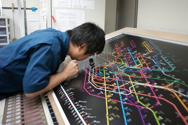 This picture above shows the web trend map which has been highly popular.
It hangs in the head quarters of Google, Microsoft, facebook, Wordpress and Yahoo! Japan. Even the CERN in Geneva now has its own copy…
"The Web Trend Map plots the Internet’s leading names and domains onto the Tokyo Metro map. Domains and personalities are carefully selected through dialogue with map enthusiasts, and every domain is evaluated based on traffic, revenue, and character."
Although it is an innovative idea, it does not portray fully accurate information as it is based on dialogue and is in essence conceptual.
"We grouped together closely associated websites, ensuring that every domain is on an appropriate line. As a result, the map produces a web of associations: some provocative, some curious, others ironically accurate. "
It is very detailed however, as you can see in the image above, it is not clearly legible from even a short distance away. The person in the image above has to use a magnifying glass to clearly read the map.
Route Maps

 The travel Dundee bus company has its own interactive bus route planner which is a practical way of finding out which buses go where. As shown above, they have designated colours for each route. It is in resemblance with the design of the the London tube system map which is another very effective use of data visualization. They both present a lot of information in an efficient way.
To see this application for yourself click on the following link and click on "Dundee route map".
 The above image was one of my own however, I could not make it interactive as flash would not let me import the objects that I had created in illustrator. This technical issue is ultimately the reason why my final data visualization application will look so simplistic.
 The above image is a mapping of the blogging activity across the globe. It is unclear how the author produced such images in terms of technical method.

 The above example is a very interesting concept. It is made by a programmer called Kunal Anand who has little to no art experience. He has allowed others to use his software to create visual images of data such as Matt Haughey's image above.

 This above example is fantastic both in the way it looks and in the way it works. It is a multimedia application designed (no doubt using extensive coding/programming techniques) to help the user broaden their musical horizons and find similar movies that could be of interest from typing in the search bar, their own favorites.
For example, the above screenshot is my own search for one of my favorite bands, The Libertines.
Upon hitting the serch button, a flurry of bubbles spawn from the initial libertines bubble containing similar or related bands that I may like.
It is not only useful it is visually impressive too. I admire this peice of software as I understand what it must have taken to program something like this which would have been far and beyond my programming abilities as an artist/designer.
to try it yourself click here: http://www.liveplasma.com/


 This above example is very effective as there are a great many number of core colours to identify what each one represents. This is a data visualization image to show the many different

 The idea I have been thinking of for the above example is using the complete web design colour pallette using circles and make each coloured circle's size correspond to its importance, common use, or popularity within web design.
 This above image could be used to click on the circles to be redirected to relevant links.
I plan to use a complex image that, in specific areas, can be clicked on with a mouse to reveal more data/content to the user such as this example taken from webdesignerdepot.com.

For the above image I thought of using a timeline of perhaps a band(s), political figure, history of a certain subject.

Using the different colours to represent different aspects of a certain subject is another idea.
Annotating them with links that can be clicked on to be re-directed to relevant website containing information on the chosen subject is, i think, another interesting approach.

 A bar graph to communicate information is fairly common however, producing unusual bar graphs could be a good a idea
Idea.
 The above image was one of my own however, I could not make it interactive as flash would not let me import the objects that I had created in illustrator. This technical issue is ultimately the reason why my final data visualization application will look so simplistic.
relates to Childcare cases across Scotland. It is a hypothetical arrangement in terms of location. Each colour represents a referral or non referral (click the image to see the colour key). The number of "stars" represents the a percentage (1%). So if there are 73 blue stars, this means that it is 73% of for example, a case referral for child well being with the remaining 27 red stars making up the 27% of non-referral cases for child well being.
Python Programming by Kunal Anand
 The above image is a mapping of the blogging activity across the globe. It is unclear how the author produced such images in terms of technical method.
 "This graph shows another view of the core. Rather than require reciprocal links, I have simply pulled out the largest connected component formed by any directional link between blogs. The obvious insight here is the relationship between LiveJournal (blue) and the rest of the core.
28/6/2006, no reciprocal links, partition=1, min weight=1
nodes=52, 952, edges=199, 052"
This is his explanation as to how he managed to create the above image. I would imagine it has a lot to do with coding however.

 The above example is a very interesting concept. It is made by a programmer called Kunal Anand who has little to no art experience. He has allowed others to use his software to create visual images of data such as Matt Haughey's image above.
"The looks del.icio.us project is my first attempt to combine graphics design with programming. The concept is to see how users develop and sustain their tagging methodologies on del.icio.us. I'm not a formal art student or have a computer science degree. I'm just curious."
He uses a programming code and creates a graphics library in python* and combines the two to create images such as the above.
*Python is a remarkably powerful dynamic programming language that is used in a wide variety of application domains. Python is often compared to Tcl, Perl, Ruby, Scheme or Java.

Examples and Critique of Data Visualization Multimedia Applications. This above image is DIGG's very cool multimedia application called "Swarm" that shows various digg users who are browsing the web. They may be reading news stories, blogs podcasts etc. If the user "diggs" the particular news story or website, their user name pops up on the screen along with an info bubble and begins to float around. This username or news bubble can be clicked to either see the users profile or to go to the particular "digged" (or dug?) subject.
 This above image is DIGG's very cool multimedia application called "Swarm" that shows various digg users who are browsing the web. They may be reading news stories, blogs podcasts etc. If the user "diggs" the particular news story or website, their user name pops up on the screen along with an info bubble and begins to float around. This username or news bubble can be clicked to either see the users profile or to go to the particular "digged" (or dug?) subject.
 To try it for yourself click here: http://labs.digg.com/swarm/
 This above example is fantastic both in the way it looks and in the way it works. It is a multimedia application designed (no doubt using extensive coding/programming techniques) to help the user broaden their musical horizons and find similar movies that could be of interest from typing in the search bar, their own favorites.
For example, the above screenshot is my own search for one of my favorite bands, The Libertines.
Upon hitting the serch button, a flurry of bubbles spawn from the initial libertines bubble containing similar or related bands that I may like.
It is not only useful it is visually impressive too. I admire this peice of software as I understand what it must have taken to program something like this which would have been far and beyond my programming abilities as an artist/designer.
to try it yourself click here: http://www.liveplasma.com/
Above, is a similar application: LastFM's TuneGlue. It holds the same purpose as liveplasma.com with the exception that it allows for the user to search for a band and obtain extensive info on the SPECIFIC BAND unlike liveplasma.com that gives results based on RELATED BANDS there is a more refined search that allows the user to slowly expand each individual node rather than a screen full of nodes that may be a bit "busy" for some users. This application allows for more interaction albeit less data on the screen to begin with.
Both are similar in design and purpose but they are diffrent in principle.
To try this application and choose your opinion, click here: http://audiomap.tuneglue.net/
To try this application and choose your opinion, click here: http://audiomap.tuneglue.net/
 This above example is very effective as there are a great many number of core colours to identify what each one represents. This is a data visualization image to show the many different
tags that are associated with the CNN website. It uses branches to connect each related tag and shows you what each of those related tags are using a colour key.
This has convinced me that using branched images with colour coded shapes to show their connection, would be a very effective way to communicate a large amount of data.
My own Ideas
The below image is a still of an example animation using plain old circles branching out from each other, originating from the big black circle in the middle.
When you roll your mouse pointer over any individual circle, text appears at the bottom right hand corner displaying info or, in this case because it is only an example, same coloured text as also shown below.
When you roll your mouse pointer over any individual circle, text appears at the bottom right hand corner displaying info or, in this case because it is only an example, same coloured text as also shown below.
 The idea I have been thinking of for the above example is using the complete web design colour pallette using circles and make each coloured circle's size correspond to its importance, common use, or popularity within web design.
Click on all images to see them in their full sizes.
Data Visualization is a way of communicating large amounts of content (data) using means other than just text.
Traditional ways of doing this is by using graphs and charts.
I have been asked to build an interactive application that can offer a large amount of data in an interesting and innovative way such as using interactive images, anmiations etc.
 This above image could be used to click on the circles to be redirected to relevant links.
I plan to use a complex image that, in specific areas, can be clicked on with a mouse to reveal more data/content to the user such as this example taken from webdesignerdepot.com.

For the above image I thought of using a timeline of perhaps a band(s), political figure, history of a certain subject.

Using the different colours to represent different aspects of a certain subject is another idea.
Annotating them with links that can be clicked on to be re-directed to relevant website containing information on the chosen subject is, i think, another interesting approach.

 A bar graph to communicate information is fairly common however, producing unusual bar graphs could be a good a idea