Thursday, 6 May 2010

20 things about I have noticed in one week

20 Things About Design That I Noticed in 1 Week (in no particular order)
and What is Influencing Me Just Now.


20. Designs That Caught my Eye

Very creative photographer named Olivier Pasqual check his website. I am starting to really get into photography. I took a photo of my son while he was having his bath on my 3 mega pixel phone and had a go at making one of those professional kids photographs with the white background.


I think it turned out not bad considering the photo was taken randomly on a 3 mega pixel camera phone.


Another piece from Olivier Pasqual
Love the Band. Love the Design

Very detailed.
Reminds me a lot of Viktor Koen. The artist's name is Derek Stenning http://lookslikegooddesign.com/illustrations-derek-stenning/
Very Good.

Love the old fashioned feel to this design. It reminds me of a 50's horror movie or comic book.
This design looks very retro. The colour use is really effective.


19. While Browsing the Internet, I Came Across This Guy


Although I think he's had too much coffee, I think he makes some really good points. Although print is one of my preferred ways to show my designs, it is eventually not going to be needed and may even be seen as an unnecessary luxury in the future due to the internet's power to deliver any of your dsigns in a much more efficient and cost-effective way.


18. E4 Idents

They just keep coming. Every time I watch E4 I notice a new Ident. Its trademark is the purple colour and it is used in every one of the idents some are very well done.


17. GraphicDesignerBlog.org

This blog gave me inspiration, determination to be better at design, despair that I will probably never be a "great" designer and hope that with practice and hard work, I can become at least a "good" graphic designer. Other people's graphic design blogs give you a great insight in to they way they think and you often find that they think much the same as you do on some things and completely differently on other things. They are great for research and thinking in perspective.

Some good posts from this blog:


16. Clever Concepts


I love the concepts behind these images. They are very creative and some are very funny. I think I would like to focus a lot of time on this sort of work and I would love to do this for my career. Yes everything is digital now. However, there will always be a need for the printed form of graphic design (unless digital screens become as cheap as paper) above are some images that I have noticed this week.


15. Vince Frost

A incredibly influential artist. Check his website. His use of creative typography especially is amazing and probably ground-breaking at the time. The type he used on a fashion magazine that spells out "fashion" in what looks like glass letters is extremely well done.

14. Make sure you get paid!!!

The Nike swoosh was designed by Carolyn Davidson in 1971, while she was a student at Portland State University. She was paid $35

How sick would you be 30 years on after the success of Nike sportswear if your design was the foundation of their success and you only got $35!!!


13. South Africa 2010 World Cup Logo

I can't wait for the world cup to start. The logo I think is effective as it gives of an African vibe terms of colour and choice of text.

12. Re-Branding

Corporations and companies have recently started to re-brand to give themselves a more appealing look. This could be for various reasons. As shown a bit further down this blog, BP re-branded to give themselves a greener image. It looks like the London Museum went for a more contemporary uplift from the basic to the abstract. Personally, I am not a fan of either Logo. I dont oike the blandness of the before version and the colours of the second logo dont go well together in my opinion.


I like Dubai internationals re-brand. It stands out a lot more than the previous version.
Cisco Sytems' new logo is also an improvement on the old version. The older version looks outdated and and really corporate-esque where-as the new logo is a little bit more approachable.
Capital One have went backwards with their re-brand. Adding the swoosh is very 1980's. And the "One" typeface could be more appropriate next to the "capital" typface.
Barclaycard's re-brand I think was a success as it has made a more streamlined logo and because of the white background it allows for more options in terms of how it can be used. The update from the quite strange blue rectangle of the old version is a big improvement. That blue rectangle is just plain ugly and is it so large in comparison with the text?


11. The New LED Advert Concept


As you can see from the video, the use of perspective here using digital screens is particularly effective. It is very inventive and leaves a lasting impression. My cube concept for the IAMCG project would have been good using these sort of screens. :)

10. Weird Contemporary Artist

Came across this video on youtube showing a series of different images from this mystery artist. There is no information or contact details for him/her. Some of it is pretty good and must have taken a lot of time where others look like children's paintings that still look like they would have taken a lot of time.. It is very contemporary and very well done I haven't seen work like this before.


9. Geometrical Head Bending Designs


I noticed this sort of design because of Mr Erik Johansson's (also see no.1 Photo Manipulation) own designs as shown above. So I decided to check out some other designers that had the ability to produce these. I can't understand how they do it and would rather just look at theirs than attempt my own me thinks.


Chris Williams has a talent for it - check the video above


Ghee Beom Kim also is a bit of a dab hand at these incredibly complicated images. Check the video above.


8. BP

Ironically, "The company has spent $7m or £4.5m in researching the new brand. It is expected to spend $25m a quarter supporting the brand change."

I included this because of BP's involvement in the oil spill disaster off the coast of America and how much money they have spent on a "going green" branding image.


The actual money they have spent on researching this does not in my opinion, have much of an impact. It went with what is supposed to be a flower: hmm... not so sure.


7. ASDA's Price Guarantee Brand.


The reason I have included this is because the concept is so simple. The change of background from white to black is instantly recognisable as something new because you are so used to the white background. I was in ASDA today and it caught my eye straight away and I thought to myself "that must be something new coming out". It goes to show that the slightest variation on a household brand can make it seem completely different and new.

6. C.G.I Animals - It's the new thing.

I've noticed a lot of companies such as 5 Alive have taken heed of Compare the Market.com's meercat success and created a "dancing dodo" which I personally find irritating but my girlfriend and other friends seem to think it's hilarious. One of my friends actually bought a carton of 5Alive specifically because he had the advert stuck in his head while in the shop. The logo is on the advert at the end that I just noticed when I got home from ASDA funnily enough.


1. Photo Manipulation - This is what is influencing me just now.


Recently, there was an article in a national newspaper showcasing a Swedish 24 year-old artist named Erik Johansson with an amazing ability to manipulate photographs to genious level. an example is below of a man ironing himself that is mind-blowing.

http://www.alltelleringet.com/ check his work out.He will give Viktor Koen a run for his money condisdering he's only 24. Some examples are below as well.

There is a growing interest in this type of art and it is something that I really want to be able to do. The process is extremly meticulous and attention to detail is imperitive to a successful end product.

This type of work is what I want to do. I still do not possess the technical ability/knowledge of how to do it to any where near this extent shown above, but I have some ideas that are in the bank. I am going to learn a lot more about photography because I believe there's no point in manipulating bad photographs.


Continuing With 20 Things...
2. Icons


Creating an effective icon is no easy task. It has to represent a specific function/action etc and be instantly recgnisable or at the very least memorable. The above image is an example of great icon design. It is based on the Helvetica Bold font face. I would say that the way they have been designed is very simplistic but very informative at the same time.


It would be hard to imagine using a computer for anything without the presence of icons. Form microsoft office to playing computer games, icons are always present in some shape or form.


3. Typography


I would love to be able to design things almost entirely out of fonts. This may seem easy, but there are a lot of things to take into consideration such as typeface, leading, kearning, pointsize and positioning. Every one of these aspects need to be done well in order to produce a great looking image using typography.


To see a great range of examples of great typography use, click here


4. Colour Use
There is a very interesting website that tries to answer the question: why is that object that colour? Click here to visit it.

Through researching the use of colour in modern design, a particular technique I really like is the use of minimal brown tones and grey tones and similar colours of that nature. To give a sort of antique felling to something I think works very well.

Click here for an example of suttle tones.


5. Adobe's CS5 promotion designs.


I love these designs. The number 5 is tranformed into little buildings and even little worlds. They are interactive and are actually a good example of data visualization as well.

Click Here to view an example.


This style has a slight resemblance to the monty python animations of old. The hands especially remind me of monty python. I think this style is very effective if executed properly. Otherwise, it would just look a like a childs attempt at drawing.


Tuesday, 4 May 2010

Digital Media Practice - Reflection

Digital Media Practice - How to get yourself employed

During my third year of studies as a Visual Communication and Media Design student, I had a module in which I had to present myself to my fellow students and show what I planned to do for the future and how I thought I would manage to get there.

It gave me a proverbial "kick up the backside" to say the least. I had to suddenly think of what specific avenue I wanted to take in terms of career path and also of all the things I needed to take in to consideration in order to get that job.

Competition.

After listening to my fellow students presentations as well as researching employment in my field, I realized that I'm not just going to get a degree and then BANG: JOB: sorted.

It is very meticulous at times as well as fiercely competitive because there are millions of people all over the world that use the same software to design things as me and the big difference between graphic design and for example plumbing, is that the plumber needs to move to where the work is where-as the designer can stay where he/she is.

This means that you can have a freelance designer producing work from China for a business in the U.K.

I realized that there just are not enough jobs for the amount of qualified designers out there. On the other hand there are a lot of jobs all over the world that anyone can argue I could go for. However, I have family ties and a 2 year old son which has limited my geographical choices.

I must try and present my perfectly to a potential employer in this country. I have to "sell myself" as is the common phrase used around University.

How do I get Noticed?

Portfolio

I need to create a detailed portfolio that showcases my work as a graphic designer/visual communicator. It must be set out so that it it is accessible but it also has to look the part.
A blog such as this can be a good way to showcase my work however, I feel that all the "scrolling down" is not the best way to keep a potential employers attention.

A website that showcases my work would be much better. See my current portfolio here:http://cboyle-design.daportfolio.com

After this study year is up, I plan to build my own website from scratch as I think that this would also showcase my talents for web design as well as graphic design.

Networking

This entails signing up to a load of different networking sites such as Facebook, Twitter, LinkedIn, Tagged etc.

I do feel that networking is a vital tool in getting yourself noticed, however, I strongly disagree with the use of the more social networking sites such as facebook and bebo. I believe that these sites are not designed in such a way that it would attract employers; I don't think they are specific enough. Plus, you have the added annoyance of your friends always trying to add you as a friend.

Sites like linkedIn are more appropriate in my opinion as these are trade-specific sites where you can connect with fellow designers.

I have a a deviantArt page that I think works pretty well and I also used their portfolio building service (see portfolio link above) which I think is quite effective in terms of accessibility.

C.V's and Covering Letters

Both are essential to gaining employment.
Curiosities in New Media Design


TyPoGrApHY.

Typography is one of the most fundamentally important aspects of any design (obviously not when no text is actually needed though).

Will Harris, who has written several books on the use of typography, says it is used to trigger subliminal emotions. For example, a Times New Roman font on a child's birthday card would not exactly be an appropriate use of type. A more playful and informal typeface would be best suited.

Appropriate or Inappropriate?

Designs of different natures require different typefaces. Formal or Informal is a good way of thinking (sort of a rule of thumb) for any designer to go by when choosing a font.

Will Harris makes a good point when saying that there are no good or bad fonts; only appropriate and inappropriate. There is a fantastic website that allows you to "filter out" an appropriate font by allowing you to choose a number of impressions and whether it is casual or formal such as:

Formal or Casual?

Traditional
Warm
Cool
Serious Friendly

Once you have chosen your set of impressions and appropriateness, the application returns with a list of fonts for you to choose from that would be useful for the "feel" of your design.

I find it quite ironic that it is a fantastic tool for helping you choose an appropriate font, the website designers could have made use of their own tool and chosen a better font themselves; especially the sort of dark gold on black colour scheme (Grumpy Criticism).

To see use this tool for yourself click here: http://www.esperfonto.com/

Examples of good and bad typography.

After researching a bit, I found that there is quite a passion for typography. There are websites dedicated to good and bad typography such as:

Bad

This website has a vendetta against the comic sans font which I agree is a very ugly font. It reminds me of credits off of a really bad cartoon or if a clown was typing, comic sans is what would appear on the screen. I actually used this in as my essay font back in 2003 when I was a sports coach and was condemned for it (and rightly so).

Although it is in my opinion a horrible font, this does not make it a bad font. It makes it inappropriate for formal things such as essays, letters or bank statements to name a few. It would perhaps be useful for such things as mentioned previously, cartoon credits or joke cards or things of such nature.

An example of comic sans is further up the page referring to the "beeping sound" sign.

Good


Not only is his use of font very effective and most importantly, appropriate his website is actually really cool as well. You will see what I mean when you click on the link. His home page is great because it gives you lots of choices in which to gain information plus the use of the old pix-elated icons of 20 years ago is, I think, really good.

Good and Bad? - Helvetica

Helvetica has to be one of the most widely used fonts in the world. It is used by many corporations to display their word marks. Such companies as:
3M, American Airlines,American Apparel, AT&T, BMW, Jeep, JCPenney, Lufthansa, Microsoft, Orange, Toyota, Panasonic,Motorola, Kawasaki and Verizon Wireless.[14] Apple Inc (taken from wikipedia) all use this font. Apple even use it for their MAC operating systems.
An example of Microsoft's word mark made with Helvetica can be seen further up the page.

It is used on almost everything in Switzerland including all forms of tax letters. This is one reason why Will Harris says that in Switzerland, the use of Helvetica in an informal design or even a formal classy design would not be appropriate because it would have a negative effect on their subliminal emotions since they are used to seeing that type of font on things that they don't like reading such as tax forms.

However, Helvetica is very much the Marmite of the design world. You either love it or you hate it. I personally love it. I think it is just a really tidy font that can be used for a very large range of designs. It all depends on the design of course. I used it in my IAMCG designs as I thought it was appropriate for the design. It was suitable for making a formal statement as well as adding a simplistic sophistication to some of my images.

Some Videos on Helvetica. The first being from the documentary about... you guessed it; Helvetica.


Is this a propaganda video against Helvetica? 8>)
(bad joke... ahem moving on)


Designers that interest me.

Andre Beato
Andre Beato is a graphic designer and illustrator form Portugal. His work is dominantly black and white. He uses very little colour at all in most of his work. He focusses mostly on the use of typography which seems to be somewhat of a trend at the moment.

Sebastian Tudor


This image displays work from an artist called Sebastian Tudor who is based in Bucharest. I am really interested in his use of typography and layout. I especially like the CD covers and CDs. They made me stare at them to read all the text which I think is a very effective way of conveying information as it is laid out in a certain way that it makes you want to know what it says.

This particular artist is especially good at CD Covers. As shown above.

The EGO cover is my favourite design. It can be interpreted that the man is drenched in paint because he has over-indulged in his own creativity or in creativity itself.

Tuesday, 16 March 2010


Examples and Critique of Data Visualization Concepts and Applications.

My own idea

Graphical Data Visualization Without the use of Code.

I wanted to use this design to represent the BBC news home page and the links attached to it and then the links that were contained in that sub-page. However, I had some technical difficulties with Flash while trying to import objects form Illustrator in which the design was created. Even when trying import the j.peg instead of individual objects, Flash just closed with no error message or anything.

So instead, I used a much more simplistic idea representing the top 20 countries' international statistics which I cannot show on this Blog because you are not allowed to upload swf. files.


Examples.

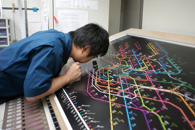
This picture above shows the web trend map which has been highly popular.

It hangs in the head quarters of Google, Microsoft, facebook, Wordpress and Yahoo! Japan. Even the CERN in Geneva now has its own copy…

"The Web Trend Map plots the Internet’s leading names and domains onto the Tokyo Metro map. Domains and personalities are carefully selected through dialogue with map enthusiasts, and every domain is evaluated based on traffic, revenue, and character."

Although it is an innovative idea, it does not portray fully accurate information as it is based on dialogue and is in essence conceptual.

"We grouped together closely associated websites, ensuring that every domain is on an appropriate line. As a result, the map produces a web of associations: some provocative, some curious, others ironically accurate. "

It is very detailed however, as you can see in the image above, it is not clearly legible from even a short distance away. The person in the image above has to use a magnifying glass to clearly read the map.
Route Maps

The travel Dundee bus company has its own interactive bus route planner which is a practical way of finding out which buses go where. As shown above, they have designated colours for each route. It is in resemblance with the design of the the London tube system map which is another very effective use of data visualization. They both present a lot of information in an efficient way.

To see this application for yourself click on the following link and click on "Dundee route map".

Idea.

The above image was one of my own however, I could not make it interactive as flash would not let me import the objects that I had created in illustrator. This technical issue is ultimately the reason why my final data visualization application will look so simplistic.

relates to Childcare cases across Scotland. It is a hypothetical arrangement in terms of location. Each colour represents a referral or non referral (click the image to see the colour key). The number of "stars" represents the a percentage (1%). So if there are 73 blue stars, this means that it is 73% of for example, a case referral for child well being with the remaining 27 red stars making up the 27% of non-referral cases for child well being.

Python Programming by Kunal Anand

The above image is a mapping of the blogging activity across the globe. It is unclear how the author produced such images in terms of technical method.

"This graph shows another view of the core. Rather than require reciprocal links, I have simply pulled out the largest connected component formed by any directional link between blogs. The obvious insight here is the relationship between LiveJournal (blue) and the rest of the core.

28/6/2006, no reciprocal links, partition=1, min weight=1

nodes=52, 952, edges=199, 052"

This is his explanation as to how he managed to create the above image. I would imagine it has a lot to do with coding however.


The above example is a very interesting concept. It is made by a programmer called Kunal Anand who has little to no art experience. He has allowed others to use his software to create visual images of data such as Matt Haughey's image above.

"The looks del.icio.us project is my first attempt to combine graphics design with programming. The concept is to see how users develop and sustain their tagging methodologies on del.icio.us. I'm not a formal art student or have a computer science degree. I'm just curious."

He uses a programming code and creates a graphics library in python* and combines the two to create images such as the above.

*Python is a remarkably powerful dynamic programming language that is used in a wide variety of application domains. Python is often compared to Tcl, Perl, Ruby, Scheme or Java.


Examples and Critique of Data Visualization Multimedia Applications. This above image is DIGG's very cool multimedia application called "Swarm" that shows various digg users who are browsing the web. They may be reading news stories, blogs podcasts etc. If the user "diggs" the particular news story or website, their user name pops up on the screen along with an info bubble and begins to float around. This username or news bubble can be clicked to either see the users profile or to go to the particular "digged" (or dug?) subject.
To try it for yourself click here: http://labs.digg.com/swarm/


This above example is fantastic both in the way it looks and in the way it works. It is a multimedia application designed (no doubt using extensive coding/programming techniques) to help the user broaden their musical horizons and find similar movies that could be of interest from typing in the search bar, their own favorites.
For example, the above screenshot is my own search for one of my favorite bands, The Libertines.

Upon hitting the serch button, a flurry of bubbles spawn from the initial libertines bubble containing similar or related bands that I may like.

It is not only useful it is visually impressive too. I admire this peice of software as I understand what it must have taken to program something like this which would have been far and beyond my programming abilities as an artist/designer.

to try it yourself click here:
http://www.liveplasma.com/


Above, is a similar application: LastFM's TuneGlue. It holds the same purpose as liveplasma.com with the exception that it allows for the user to search for a band and obtain extensive info on the SPECIFIC BAND unlike liveplasma.com that gives results based on RELATED BANDS there is a more refined search that allows the user to slowly expand each individual node rather than a screen full of nodes that may be a bit "busy" for some users. This application allows for more interaction albeit less data on the screen to begin with.


Both are similar in design and purpose but they are diffrent in principle.

To try this application and choose your opinion, click here:
http://audiomap.tuneglue.net/


This above example is very effective as there are a great many number of core colours to identify what each one represents. This is a data visualization image to show the many different

tags that are associated with the CNN website. It uses branches to connect each related tag and shows you what each of those related tags are using a colour key.


This has convinced me that using branched images with colour coded shapes to show their connection, would be a very effective way to communicate a large amount of data.


My own Ideas


The below image is a still of an example animation using plain old circles branching out from each other, originating from the big black circle in the middle.

When you roll your mouse pointer over any individual circle, text appears at the bottom right hand corner displaying info or, in this case because it is only an example, same coloured text as also shown below.


The idea I have been thinking of for the above example is using the complete web design colour pallette using circles and make each coloured circle's size correspond to its importance, common use, or popularity within web design.


Click on all images to see them in their full sizes.
Data Visualization is a way of communicating large amounts of content (data) using means other than just text.
Traditional ways of doing this is by using graphs and charts.
I have been asked to build an interactive application that can offer a large amount of data in an interesting and innovative way such as using interactive images, anmiations etc.
This above image could be used to click on the circles to be redirected to relevant links.

I plan to use a complex image that, in specific areas, can be clicked on with a mouse to reveal more data/content to the user such as this example taken from webdesignerdepot.com.


For the above image I thought of using a timeline of perhaps a band(s), political figure, history of a certain subject.


Using the different colours to represent different aspects of a certain subject is another idea.
Annotating them with links that can be clicked on to be re-directed to relevant website containing information on the chosen subject is, i think, another interesting approach.


A bar graph to communicate information is fairly common however, producing unusual bar graphs could be a good a idea

Monday, 8 February 2010

Proverbs Project and Random Stuff


More Random Stuff


Proverbs Project

We had to visually communicate proverbs without using the actual phrase.

I dont like them but I had to show something!


Random Stuff